Payment Funnel Growth Hacking
To increase conversion rates and decrease sign up abandonment, a new user flow was created, designed, A/B tested, and implemented, successfully boosting sales and getting more people through the most important funnel for the Continued brands.
My Role
- Lead designer on project
- Designed new user flows
- Designed mockups and prototype
- Frontend development of new solution
- A/B tested new solution
Project Goals
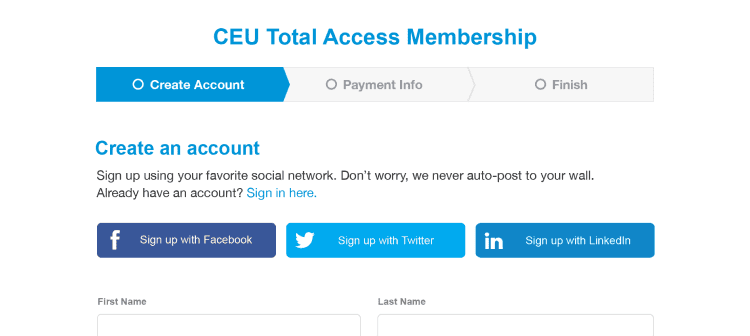
The problem: User has too much info to fill out before payment, causing significant abandonment in the sign up process.
The solution: Streamline process by moving any form/input heavy sections of sign up to a separate, post-payment process.
Design Goals
- Develop new user flow
- Modernize UI
- Social Sign On option
- Design up-sale Finish page
- Design PPC landing page
- A/B test solution
Collaboration
Marketing & E-Commerce
For this project, I worked closely with the CMO and the E-Commerce marketing manager to go over possible solutions. Research shows that giving users the bare minimum of inputs for the first step of sign up increases the chances of entering the flow and following through with the process. However, Marketing had some hard requirements for capturing certain data on step 1 (first name, last name, country, zip), so this was built into step 1 of the process with options for social sign-on as well.
Through discussions, it was decided that we could move the entire Professional Info section to post-payment, a time-consuming task that users may need to look up info (such as license IDs) to fill out entirely. This brought the time to completion down significantly, from 5-10 minutes to as little as one minute.
Engineering
The sign up flow in this case goes from SpeechPathology.com to a separate payment processing page and then back to SpeechPathology.com. Limited coding could be done on the actual payment/credit card capture page, so this had to be taken into consideration for new designs. Luckily, as the frontend lead on this project as well, I was able to work with the backend engineering team to overcome most of the coding challenges of working with a hosted payment page and matched the styles of the website pages exactly.
A/B Testing
To ensure success, we A/B tested this solution using Optimizely. Because this was a fairly complex A/B test, the solution was completely coded out using different URLs so that we could easily A/B test using a 50/50 URL split.
Future Iterations
This funnel was constantly improved by myself, the E-Commerce manager, and the rest of my team. We eventually added testimonials to this page, which also boosted conversion.
We also ran into a bot issue where hundreds of fake accounts were being created. We mitigated this with a Captcha box, which was also A/B tested to ensure a drop off in conversions didn't occur.
Outcome
We ended up seeing a fairly significant increase in conversions after these changes, in the range of 8-16% over four vertical markets. Users appreciated getting through the process faster and more efficiently and having the opportunity to fill out their professional info at their leisure.
Key Learnings
- Simple and focused is better when it comes to sales funnels
- Data-heavy forms are for after payment
- People want to see testimonials at this stage and they can help push sales throughout payment process
